Visualizing COVID-19 infection (corona virus) over time
Exploring COVID-19
The Johns Hopkins University Center for Systems Science and Engineering (JHU CSSE) maintain a GitHub repository with daily updated information about the Corona Virus. They also provide a dashboard to interact with the data.
However, even their dashboard doesn’t provide the information I would like to see: The evolution over time of the number of cases/deaths/recovery patients per country.
Thus, the idea of this notebook is to create interactive plots that we can use to monitor the evolution of the disease.
You are more than welcome to modify the notebook to predict the number of cases and do other types of analysis. The notebook can be found in my GitHub repository.
Imports
I am using Pandas + cufflinks to plot our data using Plotly.
I am also using ipywidgets to interact with the plots. If you are using Jupyterlab, you may need to refer to the installation documention.
import pandas as pd
from IPython.display import Markdown, display
from ipywidgets import interact
from ipywidgets.widgets import (
    Dropdown, SelectionSlider, Checkbox
)
from datetime import datetime
import cufflinks as cf
Getting the data
path_dict = dict(
    confirmed = ("https://raw.githubusercontent.com/CSSEGISandData/COVID-19/master/"
                 "csse_covid_19_data/csse_covid_19_time_series/time_series_19-covid-Confirmed.csv"),
    death = ("https://raw.githubusercontent.com/CSSEGISandData/COVID-19/master/"
             "csse_covid_19_data/csse_covid_19_time_series/time_series_19-covid-Deaths.csv"),
    recovered = ("https://raw.githubusercontent.com/CSSEGISandData/COVID-19/master/"
                 "csse_covid_19_data/csse_covid_19_time_series/time_series_19-covid-Recovered.csv")
)
def set_index(df):
    """Set the index for the data frame using the date

    Args:
        df: Pandas data frame obtained from John Hopkins repo
    """
    # Set region, country, lat and long as index
    index = pd.MultiIndex.from_frame(df.iloc[:, :4])
    # Set the index and transpose
    df = df.iloc[:, 4:].set_index(index).T
    # Set date as index
    return df.set_index(pd.to_datetime(df.index, dayfirst=False))

df_dict = {
    type_: pd.read_csv(path).pipe(set_index)
    for type_, path in path_dict.items()
}
Making interative plots
def interactive_plot(df_input,
                     df_label,
                     width=800,
                     heigth=600):
    """
    Plot the data using ipywidgets to interact with it

    Args:
        df_input: Input data frame, prepared by `set_index`
        df_label: Label of the data frame (death, confirmed, recovered)
        width: Width of the plot
        heigth: Heigth of the plot
    """
    # Add a new column with the total number per day
    df_input[(None, 'Total', None, None)] = df_input.groupby(level=1, axis=1).sum().sum(axis=1)

    # Get the list of countries
    country_list = df_input.columns.get_level_values(1).unique().sort_values().tolist()
    # Move Total to the top and add the No country option
    country_list = ['No country', 'Total'] + [c for c in country_list if c != 'Total']

    # Get the list of dates for the series
    date_list = df_input.index.strftime('%d/%m/%y')

    # ipywidgets:
    # We use dropdowns for the countries
    country_widget_1 = Dropdown(options=country_list, value='Total',
                                description='Country 1')
    country_widget_2 = Dropdown(options=country_list, value='No country',
                                description='Country 2')
    country_widget_3 = Dropdown(options=country_list, value='No country',
                                description='Country 3')
    # Selection slider for the dates (since the date picker has some problems)
    start_date_widget = SelectionSlider(
        options=date_list,
        value=date_list[0],
        description='Start date',
    )
    end_date_widget = SelectionSlider(
        options=date_list,
        value=date_list[-1],
        description='End date',
    )
    # And a checkbox to determine if we want the information per day or cumulative
    daily_cases_widget = Checkbox(
        value=False,
        description='Show the n. of new cases/day',
    )

    # A layout is used for the plotly figure
    layout = cf.Layout(height=heigth,
                       width=width,
                       autosize=False,
                       xaxis=dict(title='Date'),
                       margin=dict(l=60, r=60, b=40,
                                   t=40, pad=4))

    # We have a function that does the update of the data
    # using the ipywidgets defined above
    @interact(country_1=country_widget_1,
              country_2=country_widget_2,
              country_3=country_widget_3,
              start_date=start_date_widget,
              end_date=end_date_widget,
              daily_var=daily_cases_widget)
    def plot_range(country_1, country_2, country_3,
                   start_date, end_date, daily_var):
        """
        Update the plot using information from the ipywidgets.

        The plot can compare at maximum three countries at the same
        time.

        Args:
            country_1: Country 1 to appear in the plot
            country_2: Country 1 to appear in the plot
            country_3: Country 1 to appear in the plot
            start_date: Plot data from `start_date` on
            end_date: Plot data until `end_date`
            daily_var: Determine if we should show the cumulative
                or the number new cases per day
        """
        # Limit the data acconding to the countries selected and date range
        df = (
            df_input
            .groupby(level=1, axis=1).sum()
            .loc[lambda df_: (df_.index >= datetime.strptime(start_date, '%d/%m/%y')) &
                             (df_.index <= datetime.strptime(end_date, '%d/%m/%y')),
                 lambda df_: (df_.columns.get_level_values('Country/Region')
                              .isin([country_1, country_2, country_3]))]
        )

        # If daily_var is True, compute the number of new cases per day
        if daily_var:
            df = df - df.shift()
            title = F'Number of new {df_label} cases / day'
            plot_type = 'bar'
        else:
            title = F'Number of {df_label} cases (cumulative)'
            plot_type = 'line'

        # Define the title and y axis label
        layout.title = title
        layout.yaxis.title = title
        # Plot the data
        df.iplot(kind=plot_type, yTitle=title, layout=layout)
Showing the data
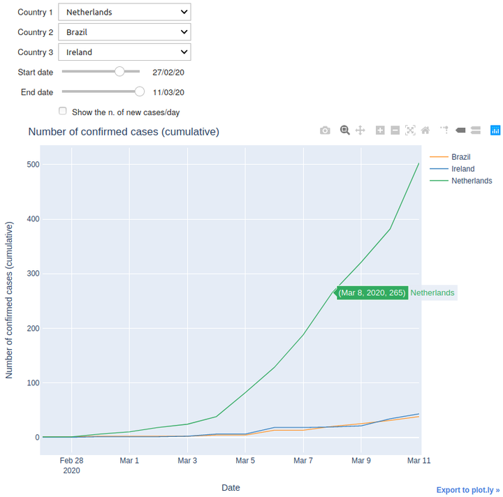
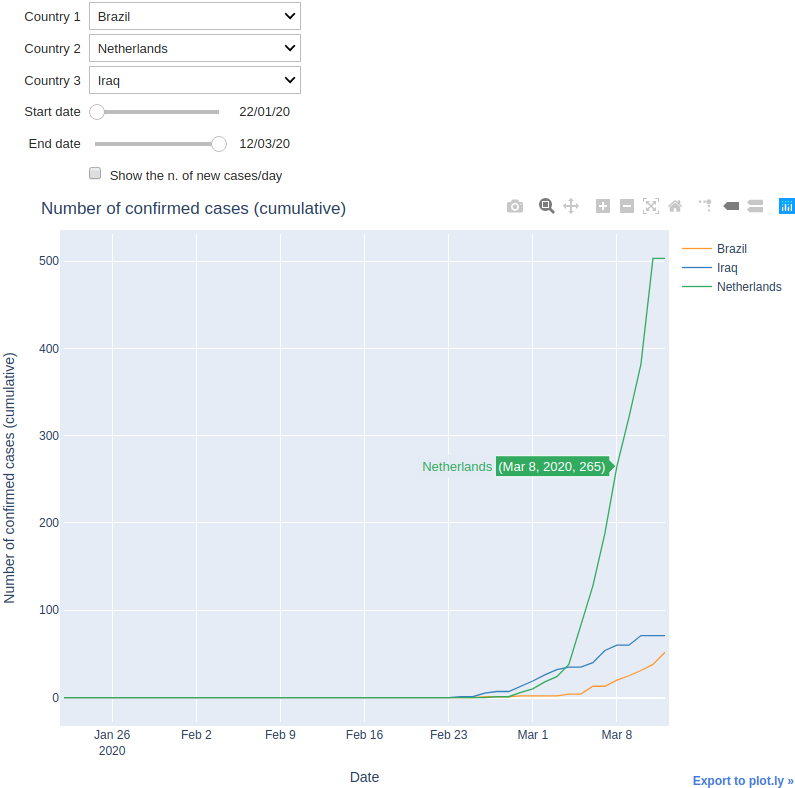
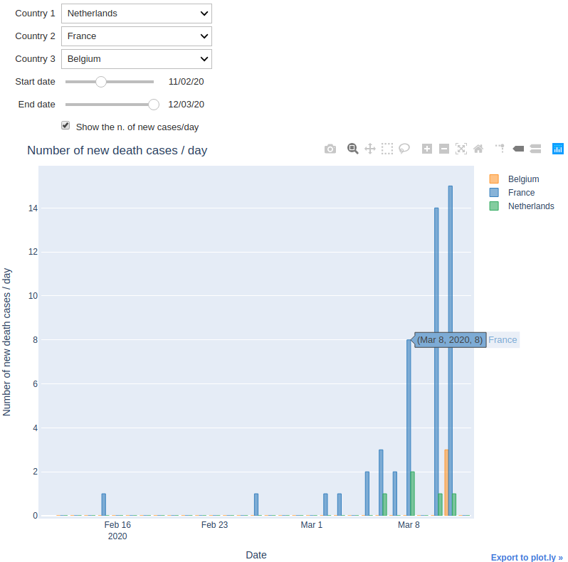
Finally, we can show our data and play with it.
Three dropdown menus allow you to select three different countries to compare.
Run your notebook and see the results :D
# Finally, we plot all the cases
for type_, df in df_dict.items():
    display(Markdown(f'---\n## Number of {type_} cases over time'))
    interactive_plot(df.rename(columns={'Others': 'Diamond Princess'}), type_)
Number of confirmed cases over time
Number of death cases over time
Number of recovered cases over time
